 From the most experienced plantsman to the rankest amateur, the one thing everyone wants in their outdoor space is COLOR! But how do you effectively use color in your garden? First, remember that there is no right or wrong when it comes to color in the garden. Color choices are a matter of personal taste. For some, a riot of color is just the ticket. Others prefer to work with a single hue.
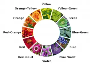
A basic understanding of color theory can help your figure out combinations that work for you, allowing you to combine blooms, foliage and other elements in ways that you will find pleasing. Let’s start with a simple color wheel which is essentially the colors of the rainbow arranged around a circle. Note that on one side of the wheel are what we call warm colors — yellows, oranges and reds. On the other side of the wheel are the cool colors — greens, blues and purples.
Taking a closer look at the color wheel, you can see a triangle made up of the three primary colors — red, blue, and yellow. They are called primary because they can’t be made by mixing other colors together. Between the primary colors on the wheel are secondary colors, which are made by mixing two primaries. These are orange, green, and violet. Going one step farther, there are tertiary colors between the primaries and secondaries, such as blue-green and yellow-orange. In our gardens, we find more of these types of colors than the “pure” primary and secondary colors.
Monochrome gardens use the simplest color scheme. These focus on just one color. A monochromatic “moonlight garden” can feature all white blossoms that are particularly attractive at dusk or at other times when light is low. Differences in plant form and texture are more important in the monochromatic garden.
Complementary colors are located directly opposite from each other on the color wheel. When used together, complementary colors intensify each other. For example, when ironweed and goldenrod bloom together in an autumn field, the whole effect of these complementary colors is greater than the sum of its parts.
Analogous colors are located near each other on the full color wheel, and can help you avoid jarring combinations. Analogous combinations harmonize or blend together. Try using three adjacent colors, with middle one as the main color, and the others on either side of it to a lesser extent. Keep analogous color intensities the same. Intensity means the amount of gray an instance of a color contains. An intense or saturated color has little or no gray. Desaturated colors (called tones) have more gray added, and appear muted.
You can also try triad colors, split complementary colors, or even double complimentary!
Don’t limit your color thinking to just blooms. You have extensive color choices with foliage, too. Beyond the many shades of greens, foliage comes in countless yellows, reds, blues, grays, and earth tones. Bark, buds, fruit and other plant parts contribute to your palette, as well. Use color on structures for interesting effects. Split rail fences, arbors, seating, structures and enhancements don’t have to be dull brown or black. Painted pots and boldly colored window boxes can complement or contrast with plantings. A vivid blue bench, brightly painted birdhouse or purple dog house can liven up your landscape!


Comments (0)
Thanks for your comment!
Thanks for your feedback! Your comments have been successfully submitted! Please note, all comments require admin approval prior to display.
Error submitting comment!
There is a problem with your comment, please see below and try again.